Developing a Gantt Chart Scheduler for Microsoft Dynamics 365 Business Central and Dynamics NAV

Nearly everything you need to know to enhance your ISV solution
with a visual scheduling client control add-in.

This is a hands-on resource for all Microsoft Dynamics 365 Business Central and NAV ISVs.
It is a guide how to best integrate a Gantt chart scheduler into a vertical NAV or Business Central solution.

The focus is on HTML5/JavaScript visual scheduler.

We share with you what to consider when embedding a JavaScript client control add-in into Dynamics NAV and Dynamics 365 Business Central. We've included a lot of visual scheduling content and examples as well so that you get a clear idea of what we're talking about.

Last, but not least, we provide a thought-provoking idea: what, if you could embed a JavaScript Gantt chart scheduler into Dynamics NAV and Dynamics 365 Business Central - without the need to write a single line of JavaScript code?

What, if this could happen with you completely working in C/AL, resp. AL? 

Want to read later?

2018-04-18 NN Hamlet - Cover - Ebook zur Pillar Page

DOWNLOAD AS EBOOK

 
CHAPTER 1

Getting started with visual scheduling


What is a Gantt Chart Scheduler for Dynamics NAV and Dynamics 365 Business Central?

The basic idea of a Gantt chart

If you want to put it into one phrase, the basic idea of a Gantt chart boils down to:

A picture is worth a thousand words

In essence, a Gantt chart visualizes complex time- and resource-oriented planning data and a Gantt chart scheduler helps to efficiently change these data by easy-to-understand drag & drop actions.

Initially, the major innovation of the Gantt chart was that it - for the first time ever - added a time element to the visualization of activities. So other than in any workflow or PERT chart, a Gantt diagram shows activities, their dependencies and their timing. 

Gantt Chart and PERT Chart Comparison

With the advent of capable software solutions, another element - beyond activities, dependencies and timing - had been added to the Gantt chart. This is: resources. As of today, the main purpose of the Gantt chart is to visualize activities, their timing, their dependencies and the resources needed to perform these activities. 

You can learn more about Gantt charts, their evolution and the general question "What is a Gantt chart scheduler" in a separate blog post.


The purpose: gaining operational agility 

Today, Gantt charts are most effective, when they are used as scheduling tool to deliver operational agility. In that context, it is important to reflect on the difference between scheduling and planning:

  • Planning defines what and how (and how much).
  • Scheduling defines when and who

Typically, planning happens before scheduling. It defines the desired outcome and a high-level road map to get there. Scheduling then breaks this down into concrete tasks with concrete times and owners (resources). Literally, scheduling aims at putting the plan into action. 

We regard Gantt charts not that much as planning tool. Instead, they are a proven instrument to support scheduling.

So, what is the value of a Gantt chart scheduler defining the when and who?

The obvious value is the visualization. A picture says more than a thousand words. This visualization in combination with any state-of-the-art software brings another value: the capability to quickly change one part of the schedule while seeing how this impacts the rest of the schedule.

The result:

  • faster and yet more profound decision making
  • capability to react to short-term incidents
  • more reliable delivery time commitments
  • better use of resource

We call this operational agility. In our experience, a Gantt chart - as long as it is used for scheduling (and neither for planning nor for optimization contexts) - delivers exactly this. Operational agility.


Does a Gantt chart mean: just manual scheduling?

First of all, there are a lot of pros and cons when it comes to manual versus automatic scheduling. A summary of these can be seen from our blog post "What is a Gantt chart scheduler?". With a Gantt chart scheduler, we aim at putting visual scheduling into the foreground.

So, what's this?

Visual scheduling is Gantt chart-led scheduling, in which the user understands what is going on and in which the user triggers any change of the schedule by visual (drag & drop) actions in the Gantt chart.

This does not tell a single word about what happens when the user makes a visual change in the Gantt chart schedule. In our point of view, this is a question of the design of the underlying Microsoft Dynamics NAV or Dynamics 365 Business Central industry solution. You as NAV or D365 BC developer can define if a visual change to the schedule can simply cause a manual change of the plan (1:1 as the user dragged & dropped) or if this change can start an automatic scheduling run following certain defined rules. 

The important thing is that the Gantt chart scheduler and the visual scheduling methodology keep the user in the driver’s seat.


Recap: the Gantt chart scheduler & visual scheduling

Here is a summary of this chapter ... so far. 

  1. The Gantt chart scheduler visualizes activities, their dependencies, their timing, and the resources needed to perform these activities.
  2. As a scheduling tool, it deals with the when and who (rather than with the what and how, which would be planning).
  3. Scheduling does not mean optimization.
  4. The Gantt chart scheduler yields operational agility.
  5. The approach of visual scheduling puts the user in the driver's seat and can be both purely manual and can work as the visual interface for some programmatic scheduling rules in your ISV solution.


Applying visual scheduling to Dynamics NAV and Dynamics 365 Business Central

You should have noticed that the visual scheduling approach is rather hands-on and entirely lacks the elements of both strategic planning and sophisticated optimization. As such, it resonates better with small and medium-sized businesses (SMB) rather than with large enterprises. Hence, we see it as great fit with the customers that you are working with.

If you want to further identify, for whom of your customers visual scheduling might work best, we recommend that you remember what scheduling is all about. It provides clear answers to the when and who. The "when" clearly puts the timing into the foreground, which means that visual scheduling is especially valuable for customers with a given set of customer orders of which the delivery time is really crucial. This is especially (but not exclusively) true for

  • Make-to-order manufacturers
  • (Small) engineering-to-order companies
  • Field service-driven organizations with rigid SLAs

If you work with these types of customers, enhancing your Dynamics NAV and Dynamics 365 Business Central industry solution with visual scheduling might be a great idea. Please continue reading if you want to learn how to best achieve this.

 
CHAPTER 2

What you should consider before you start your development of a Gantt chart scheduler for Dynamics NAV or D365 Business Central


Enhancing an ISV solution: add-in vs. add-on

The add-in versus add-on difference in the Dynamics world

At first glance, it sounds like semantic hairsplitting by students of linguistic sciences that we make a differentiation between add-in and add-on here. However, it feels like the capability to provide additional functionality to Dynamics NAV by add-on software had always been existing. In contrast, the option to deliver incremental functionality as client control add-in was introduced with the client extensibility framework just a few years ago. The conclusion is obvious: if a client control add-in would be the same as an add-on, there would have been no need for Microsoft to come up with the client extensibility framework ;-)

Without digging into too many details here (we already wrote an extensive blog post about 7 subtle but relevant differences between add-ins and add-ons for Dynamics NAV), the key differentiation can be described as follows. 

Add-in versus add-on

See the difference?

  • The add-on provides additional functionality as stand-alone software that gets attached to Dynamics NAV. 
  • The add-on comes with an own UI and an own user experience.
  • The add-in provides additional functionality as a fully integrated part to Dynamics NAV. 
  • The add-in "only" adds functionality to role centers or pages.
  • The add-in looks and feels as a natural part of Dynamics NAV.
Side note on Extensions

With Dynamics 365 Business Central (at latest), Extensions have become the technology of choice for enhancing at least the cloud-based deployments of both NAV and D365 BC. Conceptually, they are way closer to an add-in than an add-on and "just" change the options that partners have to change and interact with the Dynamics source code. With an Extension, ISV partners can literally bundle

  • (graphical) client control add-ins
  • own code to add business logic
  • own code to have the (graphical) client control add-in interact with the business logic

As the purpose of this site is to elaborate on a Gantt chart scheduler for Dynamics 365 Business Central and Dynamics NAV, and as Gantt chart scheduler by nature are very graphical, everything that is said for add-ins also applies to Extensions.


Two main reasons why you should go the add-in way

If you think of providing additional scheduling functionality - precisely: a Gantt chart scheduler - to Dynamics 365 Business Central and/or Microsoft Dynamics NAV, you still have to make your mind if you do this as add-on or add-in. Here are the two main reasons why we recommend you do it the add-in resp. Extensions way.


Superior user experience (and hence better sell-able) due to seamless integration

Overall, an add-in seamlessly integrates into Dynamics NAV and Dynamics 365 Business Central. When working with an add-in, the user does not need to "leave" the system and he stays within the boundaries of his ERP / business management software. An add-in that comes with a similar (if not the same) user experience as the Dynamics software most likely requires less explanations when presented to clients (as they are already familiar with the overall UI principles). This makes it - also for other Dynamics NAV / Dynamics 365 BC partners - easier to sell.

Side note for developers: Being bound to the overall UI of Dynamics 365 BC or Dynamics NAV might feel like a limitation at first. However, you'll quickly realize that this is actually a big "pro" as it quickly clarifies a lot of questions and helps you avoid dealing with (too) many nasty UI decisions.


Less hassle: faster deployment, less training & support

As ISV, you'll have less hassle with an add-in.

  1. A properly architectured add-in can get installed and be up and running rather in minutes than in hours or days. For example, it takes less than 10 minutes to install e.g. our Visual Production Scheduler add-in for Dynamics NAV. Now, think a step ahead and think Extensions, which can get installed with a mouse-click from AppSource. You'll never achieve this user experience with an add-on. 
  2. Also, your user is familiar with the overall user experience. See above. Nothing more to say, but: This familiarity translates into a significantly reduced need for training and .

5 Tips you should consider when developing a Gantt chart scheduling add-in

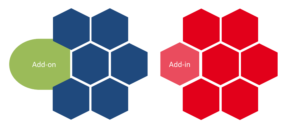
By now you've hopefully decided to go the add-in route for your Dynamics NAV Gantt chart scheduler. Before you start getting "your hands dirty", here are five tips for you to consider. They will help you not fall into some traps that are out there. Actually, we've witnessed many guys fallen into these traps. These folks did not have in-depth experience with developing visual scheduling software for Dynamics 365 Business Central and Microsoft Dynamics NAV.


#1 Keep it simple.

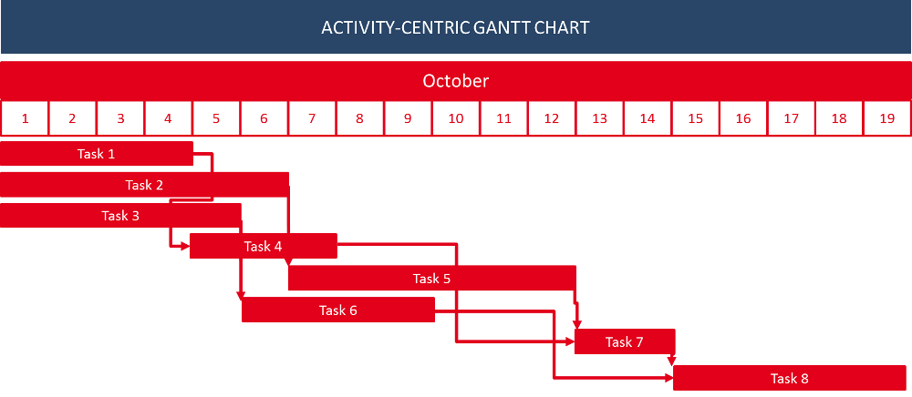
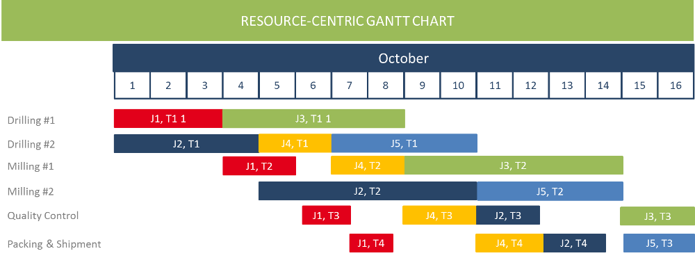
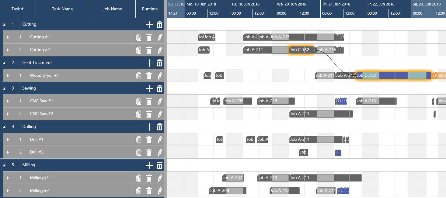
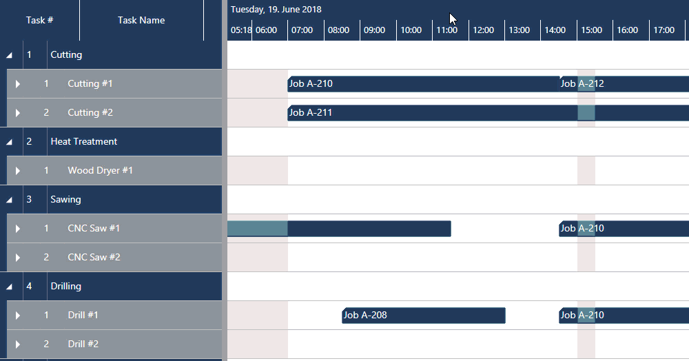
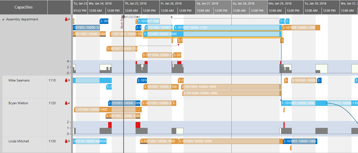
We said it before. A picture is worth a thousand words. No doubt about it. However, resist the temptation! This sounds trivial, but is important. So, let's repeat it: resist the temptation ... to show every detail of your schedule in your visual schedule. You can show bars for activities, show links, show different symbols for different types of dates (due date, milestone, material availability date, etc). You can also have text on the bars, use color coding for bars, links and symbols, add layers to the bars to represent more information, work with hatching on the bars, etc. If you work with a proper Gantt chart control (for more, see below), there are literally no limits to your visual creativity. 

Did we say it before? Resist the temptation.

Start your development with writing down a few clear user stories. These are the typical scenarios in which you want your customers to work with your Gantt chart scheduler. Write down:

  • when they should work with it
  • what the visual scheduler should show to the user in that specific context
  • what the user should do with the visual scheduler

Not more, but also not less. Keep it simple!


#2 Keep it stupid. aka: separate visualization and business logic.

This is something we learned the hard way with your own .NET-based visual scheduling add-ins for Dynamics NAV and that we'll change with bringing them on a JavaScript/ HTML5 basis for Business Central. Draw a Chinese wall between the visualization and the business logic. The visualization happens in the client, but the business logic is server-side.

Gantt chart scheduling add-in architecture

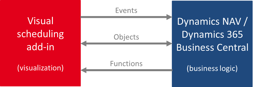
Do not keep or manage data in the add-in. Let all of this happen in the Dynamics 365 Business Central and Dynamics NAV database (this is what these systems are made for anyway). Any action (mouse click, drag & drop etc.) in the visual scheduling add-in then triggers a bi-directional communication with the underlying business logic leading to an exchange of objects between both entities. 

That way you keep your visual add-in stupid, but responsive and fast. The intelligence then comes from the business logic of NAV or D365, or from the industry solution that you build with these core technologies.


#3 Keep the data model abstract.

It goes without saying that a visual scheduler always is built to fulfill a defined requirement or to tie into a certain business process. As example, there are Gantt chart schedulers for production scheduling, resource scheduling, project planning, service order dispatching, and much more. When you start developing your first scheduler, it seems to be obvious to work with a data model for your scheduler that exactly mirrors the data model of the underlying business logic (such as a manufacturing-specific data model).

Of course, this specific approach will give you some initial tail-wind.

However, it is for sure that this tail-wind will turn into head-wind (blowing stronger, blowing more consistent) over time. In addition to the obvious benefit of you having an own data model, there are a few more advantages of an abstract data model:

  • It enables you to much faster cope with needs to changes in the underlying data model and/or business process.
  • It makes you much more flexible with respect to individual customer requests.
  • It allows a much faster transition of your Gantt chart scheduler from one subject matter area (e.g. production scheduling) to another (e.g. project planning).


#4 Prepare for easy localization.

A picture is worth a thousand words. We had this before ;-) However, you will use some words in your Gantt chart scheduler. This will happen in the timescale (words for months and days), in the table part of the Gantt chart and most likely also in tooltip texts that you provide and in context menus that you'll create.

So, in the minute you use text, you'll bite into the "universality advantage" of the picture. (Literally) everybody feels comfortable with and is confident to understand a pure visual schedule. As soon as you show "Montag, Dienstag, Mittwoch, ..." in your timescale, your user's brain will tell them: "I do not understand this. Maybe, this is German. Hmm ... seems that this is product is made for German customers only." No kidding here: we have seen this happening over and over again.

The beauty of a visual scheduler is that it can get easily understood by many, many people all around the globe. Do not make it ugly by hard-coding any language into it. Both Dynamics NAV and Dynamics 365 Business Central provide you with enough technological capabilities to separate text from the visualization and hence go for an easy localization of your visual scheduler.


#5 Buy, not make.

At first glance, a Gantt chart is a trivial thing (that makes it so easy-to-understand, by the way). There is a timescale, there is a table (e.g. either for jobs or resources) and there is the diagram that shows when and how long an activity is happening and who is working on that activity (if you show the resources in the table). This is something you can explain to a 10 years old kid. 

However, developing a Gantt chart software from scratch is a different story ... especially if the Gantt chart is to be used in mission critical B2B applications. You will be surprised how many subtle facets with respect to the Gantt chart's look & feel as well as its drag & drop behavior become relevant in that context. Hence, the clear advice is:

Focus on what is core, and outsource what is context.

Even if you are an experienced software developer: avoid going the route of developing Gantt chart software from scratch. Focus on what you are good at: your application, your business logic, your understanding of core customer processes, and your understanding of the required scheduling techniques. Build this. And get a Gantt chart control to embed into your visual scheduling software. There are many rather good Gantt chart components out there - not "just" ours ;-) -- Any control that you use will ease your living and accelerate your time to market. 

Any by the way: at the bottom of this page, we'll come up with even more thoughts on the question HTML5 Gantt chart scheduler - make or buy? 


#5+1 Bonus tip: decide for a future-proof technology

Did you pay full attention to the last sentence? We said "HTML5 Gantt chart". Why? Well, this is the most future-proof technology and we highly recommend that you build your Gantt chart scheduler for Microsoft Dynamics 365 Business Central (and Dynamics NAV) with HTML5/ JavaScript technology. 

We regard this as so important, that we'll shed more light on this bonus tip in the next section of this .

Having a choice: .NET vs JavaScript/ HTML5

DOTNET versus JavaScript
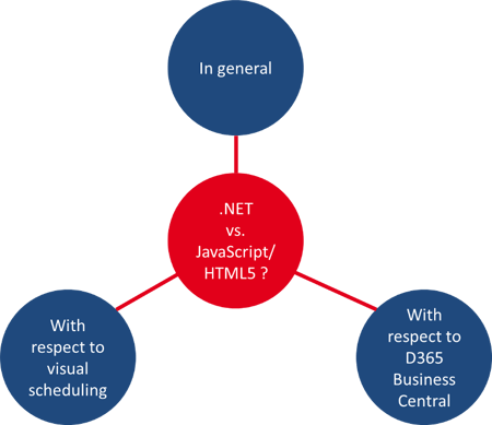
We've given the answer already. We recommend building a JavaScript/ HTML5 Gantt chart scheduler for Microsoft Dynamics NAV and Dynamics 365 Business Central. There is no doubt about it.

We thought about this from three perspectives:

  • in general
  • with respect to visual scheduling in particular
  • and also with respect to Microsoft Dynamics NAV and Dynamics 365 Business Central.

Here are the conclusions to which we came.


.NET versus JavaScript/ HTML5 - in general

Although our recommendation is clear, there are actually a few heavy-weight arguments that speak for going the .NET way:

  1. In general, .NET is a proven framework in a Microsoft environment; precisely: in a Microsoft Windows environment. 
  2. There are lot of advanced and sophisticated .NET development tools available which provide outstanding support to .NET developers and make the .NET development truly comfortable.
  3. When it comes to visual scheduling software, performance always is crucial from a user's point of view. Users will never appreciate it if it exists; but they will complain (and stop using the software), if the performance is too low. .NET technology and also .NET Gantt chart tools are proven to work both stable and with high performance. Hence, .NET reduces the risk of facing a lot performance-related issues.

The above arguments are quite robust, and equally robust is the discussed .NET framework. However, we do not live in robust times and hence JavaScript has been gaining more and more relevance ... also for seasoned .NET developers. Here are three facts that definitively speak for JavaScript if you start building a new software product.

  1. JavaScript development allows companies to remain platform agnostic. Other than .NET, it is not bound to any platform such as Microsoft Windows. With just a few changes to the service references, the same JavaScript code can be run on nearly any major platform with a web interface.
  2. This brings you a significant gain in development effectiveness and efficiency: you can develop once, but deploy to multiple environments.
  3. Last, but not least, JavaScript is run within the browser. That makes it “cloud ready” and easily accessible with Software as a Service (SaaS) products. 

De facto, JavaScript has become the standard in a cloud first, mobile first world.


.NET versus JavaScript/ HTML5 - with respect to visual scheduling

When it comes to visual scheduling in particular, things seem not to be as obvious as they are from the general viewpoint.

This is particularly true, when you look at this from a make-or-buy perspective and prefer the "buy" option for obvious reasons:

  • Developing the "code behind" a visual schedule (i.e. a Gantt chart) is not your core competence
  • Buying a UI control yields you a faster time-to-market
  • You won't have massive hassle building something rather complex for just one application

So, let's briefly reflect the state of the Gantt chart controls' market:

There is a plethora of proven Gantt chart controls available for the .NET world. Many of them are robust and have been playing a role in many mission-critical B2B scheduling applications more a decade, or more. Just take our own VARCHART XGantt control, which is used by more than 500 customers around the globe. It has been on the market for almost 30 years (starting as ActiveX control), and is seen as the most complete C# Gantt chart control for building modern and yet industry-proof scheduling applications.

Contrary to this, many HTML5/ JavaScript Gantt chart controls seem to be rather lightweight. Many of them are offered at a fraction of the price than the substantial and industry-proof .NET Gantt controls are sold. At a first and superficial glance, these HTML5 controls really look beautiful and cool and their visual capabilities seem to reach far beyond what you can achieve with .NET Gantt chart controls. However, if you dare taking a deeper dive, you'll quickly recognize some shortcomings with respect to functionality and performance.

Side note: we as NETRONIC have been a provider of interactive Gantt chart controls since the 80'ies and hence for almost three decades. The above mentioned state of the overall global HTML5 Gantt chart control market has let us refrain from entering this market. We consciously decided not to build another ordinary JavaScript Gantt control, but came up with the new approach of a "HTML5 Gantt chart framework".


.NET versus JavaScript/ HTML5 - with respect to Dynamics NAV & Dynamics 365 Business Central

This is an easy one - especially when you really look at NAV and Business Central. Microsoft already gave the answer and it is: JavaScript.

There should be no doubt about this conclusion when we look at this through the "visual scheduling glasses". The core concept that initially allowed to graphically enhance Microsoft Dynamics NAV has been the client extensibility framework. It opened the path towards client control add-ins. With an increasing power of the Dynamics NAV Web Client, Microsoft not only made it possible to integrate JavaScript client control add-ins into the Web Client, but also in the Windows Client (already back then promoting a "develop once, deploy multiple times" idea). A lot had been written about developing JavaScript client control add-ins for Dynamics NAV.

With the advance to Dynamics 365 Business Central, the switch from C/AL to AL, and the support of modern development tools, choices still are there. But they seem to have become a bit more limited:

  1. You can still develop client control add-ins and make them part of what is now called an Extension. 
  2. If you want to leverage the full cloud-based power of D365 Business Central, it must be on JavaScript basis.
  3. Just if you want to make a solution for one customer and run it in an on-premise only environment, this can still be on .NET basis.

So, if you want to build a scale-able vertical solution that includes a visual scheduler, you seem to have no other choice than realizing this visual scheduler as JavaScript client control add-in that you integrate into your respective Extension. Everything can and will work, but it the scope of where it will work is limited ... and hence its capability to scale.


In a nutshell: your challenge and our conclusion

Let's summarize this (image via giphy):

  1. TurtleYou are about developing a vertical solution for Microsoft Dynamics 365 Business Central.
  2. Thus, you need to get familiar with AL, Visual Studio Code, Extensions, etc.
  3. Your solution definitively would gain a competitive edge by integrating a visual scheduler into it.
  4. This means, that you need to integrate a client control add-in into your Extension. This will have to be in JavaScript.
  5. Thus, you need to get familiar with JavaScript.
  6. You can buy (at low cost) JavaScript Gantt chart controls, but you heard that they are rather light-weight and not "really" industry-proof.  

Quite a bit of a challenge.

Our conclusion is that it would be best for you if there would a "B2B-ready" JavaScript visual scheduler you can directly integrate with AL (as D365 Business Central developer) or with C/AL (as Dynamics NAV developer) without the need for you to write any line of JavaScript code (and run into all these HTML5, CSS etc. issues).

Well, this is our thought-provoking idea. We'll spend more details on it at the end of this page. However, before we market our approach, we prefer sharing some more visual scheduling related best practices and insights. We recommend that you apply them even if you decide to pursue your D365 Business Central visual scheduling journey without us. 

 
CHAPTER 3

Visual scheduling best practices ... from the perspective of your users


Now that we spent some time on all general technological considerations that you should make before developing a visual scheduler for Microsoft Dynamics 365 Business Central or Dynamics NAV, we also shed a light on best practices. With this, we also turn the perspective from you to your users and share some insights what they really expect.

Best Practices and Requirements for Dynamics 365 Visual Scheduler-1
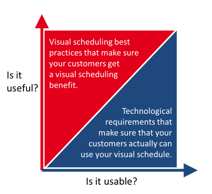
We provide this users' perspective from two angles:
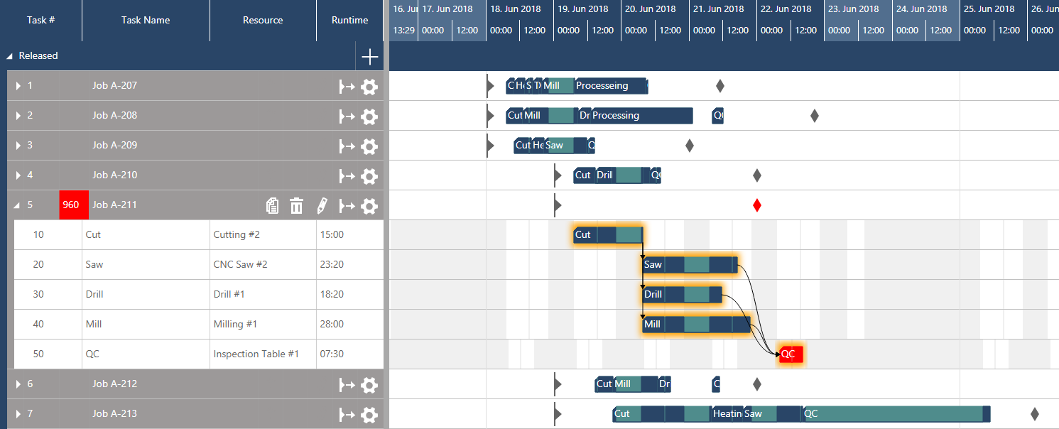
  • Is it useful? 

    Here we look at visual scheduling best practices that make sure your customers get a visual scheduling benefit.

  • Is it usable?
    This section deals with some of the technological requirements that make sure your customers can actually use your visual schedule. If these are not met, it is irrelevant how useful your Gantt chart actually is (as it cannot be used).

We recommend that you apply both angles when designing and defining the architecture and scope of your visual scheduler.

5 Best practices for Gantt chart scheduler

We have been developing Gantt chart and visual scheduling software for more than 30 years. During this time, we celebrated major achievements but also burnt our fingers with some fancy ideas that we had, and some tough requirements that we tried to cope with. Overall, this helped us building an invaluable treasure of experience with developing visual scheduling software. 

Based on this experience, we can share with you five key best practices that we recommend to apply when building a visual scheduling product. Please take into account that list of best practices is not meant to be full-fledged. It is more a kind of "minimum list" that you should really take into account.


#1 Work with multiple views

When thinking about a Gantt chart, people typically have something in mind that comes from a world where Gantt charts are used for project management purposes. This is: work breakdown structure plus a bunch of symbols in a table on the left hand side, the timescale on the top, and one per bar for each task in each line of the Gantt chart. However, this is only one perspective that you can have on your schedule: It consists of data related to tasks and their timing, whereas the resources that are meant to work on these tasks remain somewhat hidden. 

Instead of building just a Gantt chart as everybody has it in mind, ask yourself: "Which questions do my users want to answer with this type of visualization?". This is really fundamental to build a visual scheduler that yields the expected operational agility for your users. Typical, but quite different questions that can both be answered with a visual scheduler are:

  • Am I still on track to complete this job in time?
  • Do I have free capacity to squeeze in a rush job tomorrow?

These are just example and there are much more questions that a visual scheduler can answer. The point here is: we highly recommend that you create different views on your data - with each view targeting at primarily answering one particular question. Just look at the below two screenshots. Both show a visual schedule representing the exact same data. The first one looks at the respective jobs and is more geared towards answering timing-related questions. The second one looks at the resources and is better suited to provide information about the resource utilization and resource gaps.

Visual Scheduler for Dynamics 365 Business Central - Jobs View

A job-centric view - providing timing information

Visual Scheduler for Dynamics 365 Business Central - Resource View

A resource-centric view - providing utilization information


#2 Dynamic timescale

Of course, the horizontal axis of a visual schedule is a timescale. There are a lot of applications, in which you can press a button somewhere in the software to change this timescale from days to weeks to months and to whatever time-frame. This works, but gives the impression of time being something static.

We recommend to look at this in a more dynamic way. For us, the timescale - in combination with the mouse-wheel - is the perfect instrument to seamlessly zoom in and out into your schedule. We believe that this truly allows for better scheduling within Dynamics NAV and D365 Business Central and wrote an entire blog post about it.

Just having an either granular or a broad view on your schedule bring very little real value on their own. It's the combination of the two, achieved through the flexibility of the wheel on your mouse, that enables the real agility.

Visual Scheduling for Dynamics 365 - Dynamic Timescale


#3 Use histograms/ load curves to visualize resource loads

Understanding the utilization of the resources and making a proper use of the available capacity is one of the key challenges when it comes to visual scheduling. Hence, visualizing the resource load in a load curve ("histogram") is definitely a must have. Overloads as well as unused resources can be recognized immediately. This is especially useful if you want to monitor the aggregated load of a resource group consisting of multiple resource (with varying capacities).

State-of-the-art Gantt chart scheduler also allow to show these kind of load curves within the Gantt chart.

Dynamics 365 Business Central Resource Scheduling Histogram


#4 Work with visual alerts

Visual alerts translate your business rules into the visual scheduler and thus bring them to the planner's attention. They are the "soul" of visual scheduling. Use data-driven visualization and send signals to warn the planner if there is something he should take care of. That way, you help the planner to focus on the exceptions and to take care of the truly crucial issues. 

In general, the possibilities and the scope for visual alerts is unlimited. But - as often - less can be more and hence we recommend that you work with visual alerts just for those cases that need the immediate attention of your scheduler. Some ideas:

  • Mark jobs that run danger to be late
  • Highlight resource overloads ... or "underloads" in your bottleneck
  • Highlight jobs in which you work with expensive material and have a very low error tolerance
  • Highlight if the timely start of a job is on risk due to missing material
  • etc.

As you can see: the options are manifold. The good news is that both Microsoft Dynamics 365 Business Central and Dynamics NAV consist of many standard data fields that allow building these kind of visual alerts into your visual scheduler. But always keep in mind: less can be more.


#5 Drag & drop scheduling with immediate visual feedback

Last, but not least: the whole point of scheduling is not just to look at data. Scheduling is all about changing planned data:

  • the timing of jobs and tasks
  • the duration of jobs and tasks
  • the timing of due dates
  • re-assigning a task from one resource to another
  • giving a task or a job a higher prioprity
  • squeezing in a rush order
  • etc.

Your customers' businesses are agile, and thus should your visual schedulers be. Drag & drop allows for intuitive, quick and simple scheduling changes while never losing track of the modifications’ effects on the overall plan. 

This is something, your users will expect. No doubt about .

3 Requirements for Gantt charts as visual scheduler

From the above you now should have some ideas how to build a visual scheduler that is useful for your customers. Now, let's have a look how you can actually make it also usable for your customers. In our experience, this all boils down to three key requirements (of course: there are more; but let's keep it straight-forward and "clean" here).


#1 Performance

This sounds trivial, but is so important. What is the value of a beautifully designed visual schedule, if your user has to wait a perceived eternity for the Gantt chart to react after a drag & drop change? Even worse: how will your users accept your visual schedule if it seems to take ages before they actually can see the first Gantt chart?

There is a need for speed. Period.

If you decide for developing your Gantt chart software on your own, design for performance from day one. If you instead opt for a Gantt chart control to become part of your visual scheduling solution, make sure your vendor designed it for performance. Think that this is too trivial? Well, there are vendors out there, who give their users tips how to optimize their Gantt chart controls when they are loaded with 200 tasks. No kidding! 

Some anecdotal evidence from our own history: a few years ago, we started with the complete new development of Gantt chart technology for the HTML5/ JavaScript world. After six months (with a team two) we reached a state in which we had a beautifully looking visual schedule which even had some features (animation, histogram within the Gantt chart, etc.) that we never had with our proven, 25+ years old VARCHART XGantt .NET Edition. We got excited an decided for a "stress test". That means, we took a sample database that mirrors typical job/task/resources volumes of a challenging, but still typical B2B customer and loaded it into the then new JavaScript Gantt chart. Guess what? No more excitement! It took a few minutes to load, and almost a minute to update once we made drag & changes.

The development team then quickly came up with some nice "performance improvement" concepts. However, we stopped the entire project. We told ourselves: if the first version already shouts for performance optimization measures, we will spend - in the long run - more time with performance tweaks than with functional enhancements. Hence, we literally trashed everything and decided to start completely new with looking for an alternative approach (which would be more likely to be high performing). Finally, we found this approach and one (!) further year later (!) we were again where we initially had been after six months.

There is a need for speed. Period. Make sure that your Gantt chart developers fully embrace this.


#2 Dynamic layout to allow visual alerts

Control_Cockpit_StockSnap_ZP9VTB4PMS (2)Developing effective visual scheduling systems for the rather complex and dynamic domains of your customers is a serious challenge for designers and developers. Poor usability and a too static approach is one of the core barriers to adoption and a deterrent to its routine use.

A visual scheduler unleashes its full potential to your clients, if it works with a clear set of different visual alerts. These alerts do not necessarily require the user to take action, but act as communication tools to cue something noteworthy. In that regards, the visual alerts are used to make certain items stand out from the crowd. Consequently, they are not always present but appear under certain conditions and can come in various forms (depending on the context they are used and the information they should convey to the users). Visual alerts can take the form of

  • Icons
  • Typographical styling
  • Enlarged size
  • Color variations
  • Layout variations
  • Animations 
  • And more

In order to build meaningful, context-driven visual alerts, make sure your visual alerts:

  1. Are tiered by severity.
  2. Have concise text.
  3. Provide the user with clear response/ call-to-action options.
  4. Use controlled color sets.
  5. Come with a consistent (visual) terminology.

All above translate into significant UI definition and design challenges for your product teams. Well, getting this done from a conceptual point of view is just one side of the medal. The other is that the tool/technology that you select for your Gantt chart scheduling client control add-in needs to cope with the above. It must support the design of a dynamic layout to support context-sensitive visual alerts.

Without that capability, you will lose a hell lot of the communication capabilities and benefits that a visual scheduler can bring to your Dynamics 365 Business Central and NAV vertical solution.


#3 Multiple bars in one row

"Multiple bars in one row? Come on, you are kidding me!" - Well, seriously: when you look out for a ready-to-use Gantt chart scheduler or Gantt chart control which you embed into your application, make sure that it allows showing multiple bars in one row. We know, that this sounds a bit silly. However, it can truly make a difference.

Why? 

Many people - including many software developers that work on Gantt chart software - look at Gantt charts from a very activity-centric point of view. For them, a Gantt chart shows which tasks of a project or a job have to happen in which sequence to reach a certain milestone. This looks as follows.

Activity-centric Gantt chart

See what we mean? There is one bar per row.

This works well if you just want to look at your schedule in an activity-oriented way. However, in the very beginning of this guide we already pointed out that a Gantt chart not only can visualize activities, their timing and their sequence, but that they can also shed a light on which resource is supposed to work on which activity when.

If you want to become resource-centric and use a Gantt chart scheduler to deal with resource allocations and their timings, you will appreciate if you can display multiple bars in one row.

Resource-centric Gantt chart

Do you recognize the difference? With multiple bars in one row you can actually build a Gantt chart that allows you to visualize the load of your resources in way that your customers will understand immediately.

Hence, we strongly recommend that you look out for a tool that can be both:

  • an activity-centric visual schedule and
  • a resource-centric visual schedule

In order to achieve this, you need to be able to show multiple bars in one row.

 
CHAPTER 4

Make or buy?


A JavaScript/ HTML5 Gantt chart scheduling add-in for your ISV solution: make or buy?

OK ... time to sum this up and to come to a conclusion. In the very beginning of this page, we said that we'll close with a thought-provoking idea. Let's recap before we actually get there. By now, you learned the following:

  • What is a Gantt chart scheduler for Dynamics 365 Business Central and NAV
  • The difference between an add-in and an add-on
  • General tips for developing a Gantt chart add-in
  • The pros and cons of .NET versus JavaScript/HTML5
  • 5 best practices of Gantt chart scheduler
  • 3 requirements for Gantt charts as visual scheduler

So, ultimately you need to look out for some kind of JavaScript Gantt chart tool to become the core of your visual scheduler in your Dynamics 365 Business Central vertical solution. This brings you to the make or buy question.


Why make

The advantages of the make alternative are rather obvious: If you build something on your own, you are in full control:

  • You own the code.
  • You own the IP.
  • You own the spec.
  • You own the design.
  • And you own the road map.

With building your own Gantt chart scheduler, you do not become dependent from any other vendor and can act completely on your own. This provides you with the maximum flexibility - both technically and commercially.


Why buy

Actually, these are lot of strong arguments that speak for the make alternative. However, this maximum flexibility comes at some cost and hence here are also considerations that speak for the buy alternative.

  1. Time-to-market. Come on: the wheel already exists. No time to invent another one. There a lot of good to great Gantt chart controls out there, and using them will accelerate your time-to-market.
  2. Hidden Gantt chart complexity. The Gantt chart is an easy-to-understand and hence compelling visualization technique. Well, in order for a Gantt chart to be easy on the surface, you need to build and manage a lot of complexity under the surface. Performance, dynamic layouting and multiple bars in one row are just a few examples. You can easily enhance this list. Dealing with these questions for the first time will definitively further delay your time-to-market. Plus, it comes at:
  3. High opportunity cost. Developing a visual scheduling software is nothing you do overnight. It requires that you assign a team of developers to it and give them some time to learn and excel. During this learning phase, the same team could alternatively work at some of your core tasks/projects - at a much higher productivity rate. These high opportunity cost always occur if you engage in areas where you cannot build on your core competence.
  4. Not building on your core competence. The first three issues are rather generic. This one is more specific to the Microsoft Dynamics 365 Business Central and Dynamics NAV world. We know how rare software developers are in this channel, and we know that still the vast majority of them is specialized on C/AL (now learning AL). However, if you want to build a visual scheduler add-in, you ultimately need to learn either .NET or JavaScript/HTML5. Both are rather common languages - but in the specific D365 BC and NAV channel, both are not really the core competence of a typical developer.

So, there are a lot of reasons to buy a Gantt chart control to accelerate your visual scheduling project. And we would 100% agree with this conclusion if the world would still be PC-centric and if you were looking for a tool to help you build a visual scheduler for the Dynamics NAV role-tailored client. .NET would be your choice for a client control add-in and there are a lot of truly B2B-ready .NET Gantt chart controls out there.

Our observation is that this is different in the JavaScript world - which you'll have to enter if you want to deliver a visual scheduling experience for Dynamics 365 Business Central. This brings us - finally - to our thought-provoking idea:


Take the best of both worlds

What, if you could embed a JavaScript Gantt chart scheduler into Dynamics 365 BC and Dynamics NAV - without the need to write a single line of JavaScript code?

This is the question that we initially raised on this page. And this is a question we asked ourselves again and again. Ultimately, we made finding and providing an answer to this question the purpose of a strategic internal development project.

Here are the cornerstones of and key requirements for this development project:

  1. Develop a "B2B-ready" Gantt chart software framework based on JavaScript technology.
  2. Use this framework for our own visual scheduling scheduling add-ins for Dynamics NAV and 365 Business Central, as well as for cloud-based stand-alone products like www.just-plan-it.com
  3. Make this JavaScript framework not only "B2B-ready", but also "Microsoft Dynamics-ready" so that it can get easily integrated into any vertical solution built either on Dynamics 365 Business Central or Dynamics NAV. 
  4. This means in essence: make this framework accessible through, addressable via and configurable with an API that Business Central and NAV developers can work with.
  5. Last but not least, design this API in a way that C/AL developers can use C/AL when embedding this framework into their applications, and that AL developers can do the same with AL.

With this, we now have a JavaScript framework that Dynamics 365 Business Central and Dynamics NAV ISVs can buy from us and with which they can make individual visual scheduling solutions for both on-prem and cloud-based scenarios ... without the need to learn JavaScript/HTML5.

This framework is already used by a few selected early adopting ISV, and we'll share their experiences shortly. What these ISVs get from us:

  • A custom-made (for them!) JavaScript visual scheduling UI widget,
  • that understands the business logic of their vertical solution,
  • that can get seamlessly integrated into this solution,
  • and that can get configured, modified and individualized by the ISV through the API
  • without the need the learn JavaScript/HTML5.

It requires a development involvement from us (to make the UI widget understand the ISV solution's business logic), but accelerates time-to-market and makes everybody focus on their core competences.

We find this approach thought-provoking and are glad that we can deliver to it.

Are a Dynamics 365 Business Central or Dynamics NAV ISV?
Need visual scheduling for your vertical solution?
Need it in JavaScript to be as platform-agnostic as possible?
Talk to us: we can help you ;-)
Let's discuss  a visual scheduler  for your ISV solution!